
JPMorgan Chase / 2022—2026 / Senior UX Designer
Chase Travel.
I worked alongside another lead designer to lead and evolve the Chase Travel Design System, helping teams build consistent, accessible and reusable product experiences through component development, documentation, design audits and designer enablement.
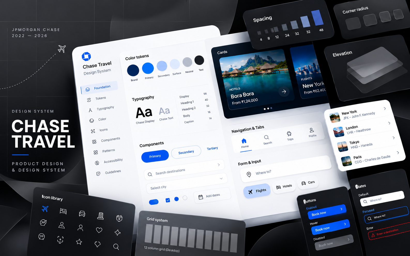
Due to confidentiality obligations, this case study uses illustrative visuals and generalized examples rather than proprietary internal files or production deliverables.
02 / Role
Role & responsibilities
What I contributed. A shared lead role: I worked alongside another lead designer, and decisions were made together.
- 01
Shared direction
Set system direction and made component decisions together with another lead designer, rather than as a sole owner.
- 02
Component decisions
Evaluated incoming requests to reuse, extend or create, keeping the library lean and avoiding parallel versions of the same pattern.
- 03
Component craft
Defined anatomy, properties, variants, states and behaviour, with every value referencing a foundation token.
- 04
Documentation
Wrote usage guidance and refined it whenever recurring questions showed a rule was unclear.
- 05
Design reviews
Audited Figma files for detached, duplicated or inconsistent patterns and gave actionable, reasoned feedback.
- 06
Engineering partnership
Aligned with engineers on expected states, behaviour and implementation details before and during build.
- 07
Adoption
Coached designers, maintained the library and kept the system improving as product needs changed.
03 / Architecture
How the system is organised
Each layer is built only from the layer before it. Supporting practices run across every layer, not as a final step.
Foundations
- Typography scaletoken
- Spacing stepstoken
- Colour tokenstoken
- Radius & elevationtoken
Components
- Buttoncomp
- Text fieldcomp
- Checkboxcomp
- Navigation tabcomp
Composed patterns
- Search formpattern
- Date range pickerpattern
- Travel cardpattern
- Booking summarypattern
Product experiences
- Hotel searchscreen
- Flight resultsscreen
- Trip detailsscreen
- Checkoutscreen
04 / Lifecycle
How component work progresses
A representative workflow, not a reproduction of an internal process. It starts with a decision, not a drawing.
When
The need matches an existing component's purpose and behaviour.
Then
Use as-is; adjust only content and documented properties.
When
The purpose is the same, but a new variant, slot or state is genuinely needed.
Then
Add a documented property to the existing component rather than forking it.
When
No existing component shares the purpose or behaviour.
Then
Propose a new component, then take it through the full lifecycle.
Avoiding duplication · before creating, search the library and active files for components with the same purpose; similar-looking components with different behaviour are a signal to consolidate.
- 01
Propose
A need is raised with real product context.
- 02
Design
Explored against existing tokens and patterns.
- 03
Review
Critiqued with the co-lead and peers.
- 04
Validate
Checked across states, content and viewports.
- 05
Document
Anatomy, usage and behaviour captured.
- 06
Share
Published and walked through with teams.
- 07
Audit
Usage reviewed in live design files.
- 08 ↺
Improve
Findings fed back into the library.
Anatomy
- 1 · Label (required)
- 2 · Input + placeholder
- 3 · Optional trailing icon
- 4 · Helper / error message
Properties
- Size
- Medium · Large
- Icon
- None · Leading · Trailing
- Helper text
- On · Off
- State
- Default · Hover · Focus · Disabled · Error
States
Usage
DoAlways show a visible label; placeholders are examples, not labels.
Don'tSignal errors with colour alone; pair them with an icon and message.
Button · Primary
- Height
- size-touch (min 44px)
- Padding
- space-3 / space-4
- Label
- type-label · single line
- Fill
- color-action-primary
Intended use · The single main action in a view, such as confirming a booking.
States & behaviour
- Rest, hover, focus, pressed, disabled, loading
- Loading keeps width; label replaced by spinner
- Long labels wrap to two lines, never truncate
Accessibility
- Visible focus ring meets contrast
- Native button element, not a styled div
- Disabled reason explained nearby
- Min 44px target
Handoff notes
- Values referenced to tokens
- States mapped to coded variants
- Open questions logged and resolved with engineering before build
05 / Quality
Quality, accessibility & compliance
How work is validated. Precision comes from shared tokens, reusable components and documented rules checked across realistic states, not isolated visual tweaks.
Hotel details and guest informa-tion
- A · Off-scale heading; awkward hyphenated wrap
- B · Detached inputs, 16px / 14px gaps, offset alignment, no labels
- C · Custom radius, icon off-grid, disclosure hidden behind a tooltip
- D · One-off button, low contrast, no focus, loading or disabled states
Guest details
Visible condition text sits with the offer.
- A · Heading token; copy shortened to wrap cleanly
- B · Library fields on space-3, aligned to the grid, labelled
- C · Card radius and icon from tokens; condition text visible
- D · Library button with documented states
Validated across states
Design → build checkBuilt screen compared with the spec at key breakpoints.
DiscrepancyField gap rendered at 12px vs space-3 (16px).
ResolutionMapped to the token in code, not patched by eye.
Traveller details
Must match the traveller's passport. Format DD / MM / YYYY.
Error: 31 February isn't a valid date. Check the day.
- 01Contrast & typeText and focus rings checked against contrast guidance; body never below a readable size.
- 02KeyboardLogical tab order; visible focus on every interactive element.
- 03Labels & instructionsPersistent labels; format and requirements stated up front.
- 04Error recoveryError named in text with icon, next to the field, explaining how to fix it.
- 05DisclosuresImportant terms placed in the reading order, with clear hierarchy.
- 06Specialist inputOpen questions flagged early for compliance, legal or accessibility partners. Design review isn't formal approval or certification.
All examples are original and fictional, created for this portfolio. They do not reproduce JPMorgan Chase production work, internal files or specifications.
Component in practice
One component. Three experiences.
A Price Summary needs to remain clear and trustworthy across every screen size. The hierarchy stays consistent while the layout adapts to how people review and confirm a booking.
Expand the price details or confirm the booking to try it.
Outbound · Thu 12 Mar
SFO
San Francisco · 08:15
JFK
New York · 16:50
- Passenger
- 1 adult · A. Traveller
- Cabin
- Economy · Nonstop
- Baggage
- 1 carry-on, 1 checked
- Fare rules
- Changes allowed, fee applies
Contact
a.traveller@example.com
Seat
14C · Aisle
Illustrative recreations created for this portfolio. Fictional itinerary and pricing; not Chase production screens or data.
Design rationale
- 01Clear hierarchyThe final total is immediately scannable, while the detailed breakdown remains accessible.
- 02Responsive adaptationThe same pricing logic and visual hierarchy work across screen sizes, while the layout changes to suit each context.
- 03Consistent interactionDisclosure behavior, price formatting, dividers, typography, and CTA styling remain consistent across all three implementations.
Stays consistent
- Price calculations
- Typography
- Spacing tokens
- Price-row styling
- Total emphasis
- Interaction behavior
- Accessibility principles
Adapts
- Layout
- Density
- Positioning
- Available space
- Presentation of booking details
06 / Enablement
Leadership & enablement
How I supported adoption, working as one of two lead designers on the system.
- ReviewRan design reviews and Figma audits, explaining the reasoning behind the right pattern, not only flagging the issue.
- CoachCoached designers on correct usage, and on extending shared patterns instead of rebuilding them.
- ClarifyTurned recurring questions into clearer guidelines, so the same question didn't need answering twice.
- PartnerWorked with engineering on expected states and behaviour, so intent survived implementation.
- SustainHelped teams adopt the library and keep it maintained as products evolved.
07 / Impact
What this work supported
Qualitative outcomes, not measured results.
- 01Clearer, shared usage guidance for designers
- 02Fewer one-off patterns reaching review
- 03Accessibility built into components rather than added late
- 04Smoother design-to-engineering handoff
08 / Reflection
A design system is more than a library.
Components are only the visible part. A system stays useful because its decisions are written down, its rules are checked against real states, and its usage keeps being reviewed.
Leading it alongside another designer taught me that consistency is earned through judgement: knowing when to say "reuse this", when to extend, and when something new is genuinely needed.
Back to Work